Why We Kept The Dark Timber
In a recent renovation concept, one design decision was never in question: the original timber features would stay. What followed was a more interesting exercise — finding ways to create lightness, air and cohesion around them.
One of the first suggestions many people receive when renovating an older home is to paint the timber white.
It promises instant brightness. More light. A fresher, more contemporary feel.
Sometimes that's the right decision.
But occasionally, what we're calling a problem is actually the most beautiful part of the house.
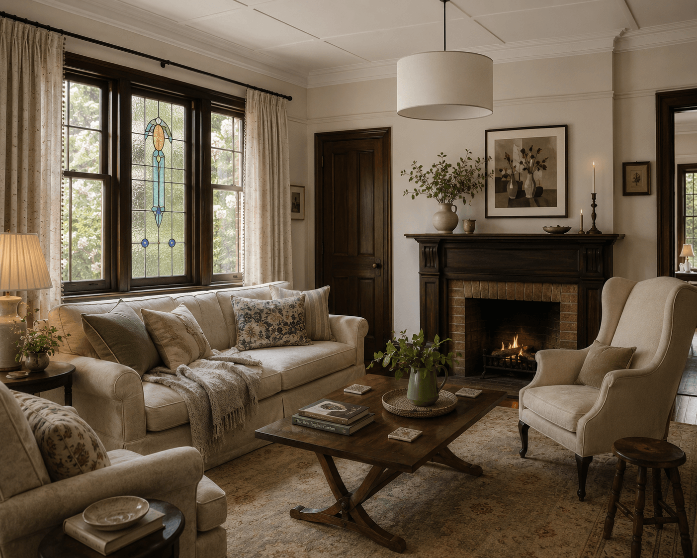
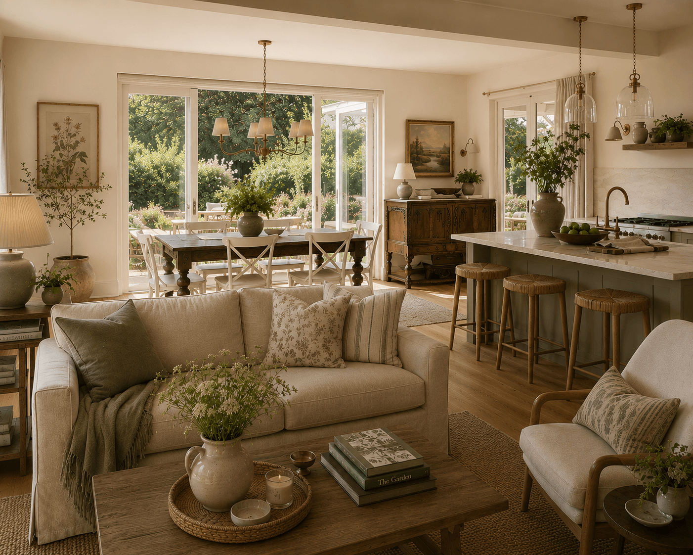
A palette of natural fabrics, aged timber, soft greens and handmade details helped create a sense of lightness around the home's existing dark timber features. Rather than competing with the original character, these materials were chosen to complement it.
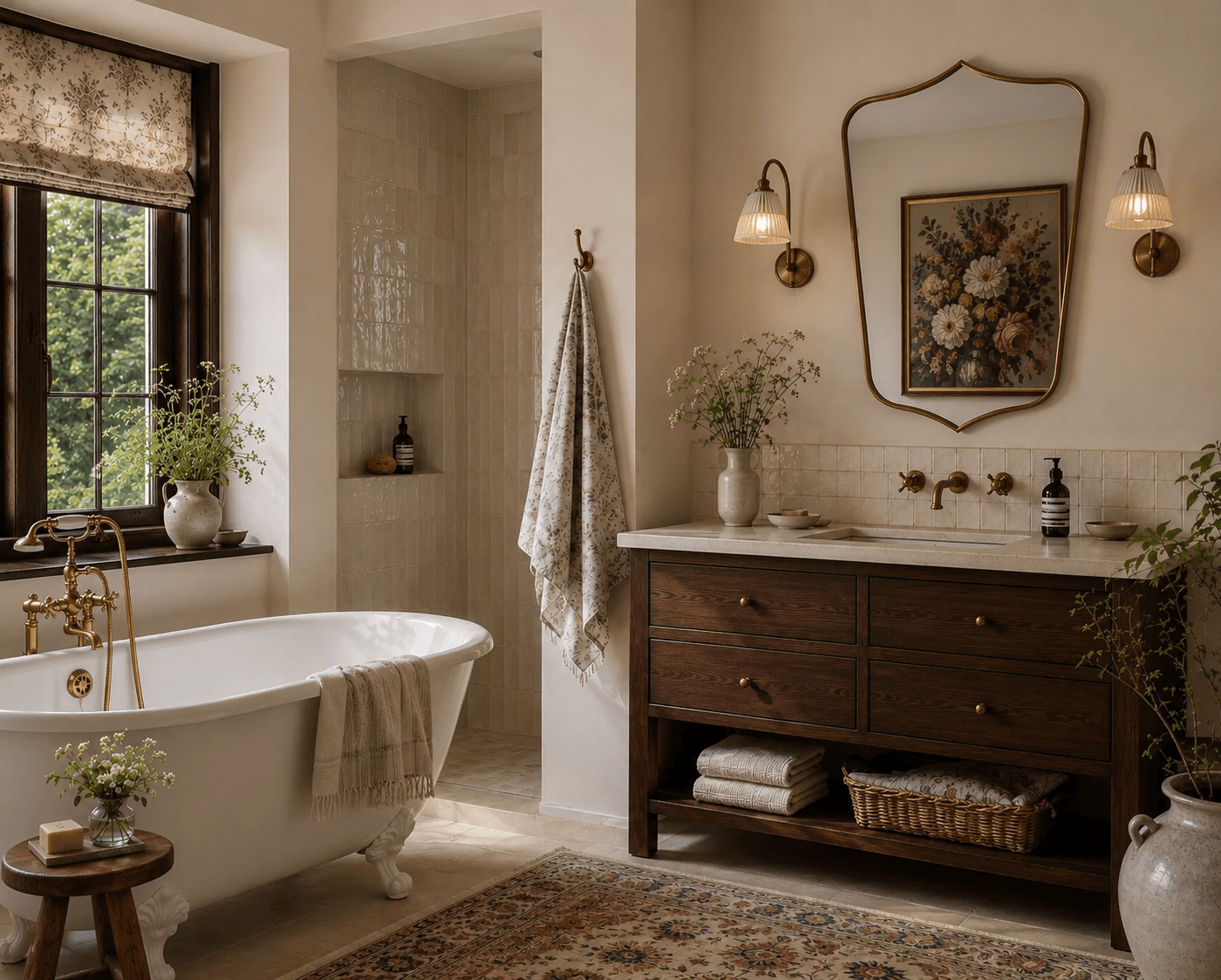
Recently, I worked with a client whose home featured richly stained timber windows, doors and trim throughout the original part of the house. Like many character homes, these features had become one of its defining qualities. They brought warmth, history and a sense of permanence that simply couldn't be recreated.
Yet there was also a concern.
How could the home feel light and airy while keeping these darker elements intact?
It's a question I hear often. Somewhere along the way, we've come to associate lightness with whiteness. White walls. White trim. White kitchens. White everything.
But lightness and air are not really about colour at all.
They're about feeling.

Lightness Is Not The Same As Whiteness
Some of the most calming homes I've enjoyed haven't been particularly white.
They've contained depth, texture and contrast. They might feature aged timber, collected furniture, bookshelves, artwork and layers of natural materials. Yet they still feel peaceful.
The reason is that calm doesn't come from removing every dark surface. It comes from balance.
Natural light, thoughtful colour palettes, visual breathing space and carefully considered furnishings all contribute to how a home feels.
When we reduce lightness to a paint colour, we risk overlooking the many other elements that shape atmosphere.
In this project, rather than painting over the existing timber, we explored ways to allow it to remain while creating a lighter overall feeling throughout the home.
The timber wasn't treated as a problem to solve.
It became part of the story.
The original timber doors and architraves provide depth and history, while lighter walls, natural textures and a restrained palette create a sense of openness throughout the home.
Working With Character Rather Than Against It
Older homes often possess qualities that would be difficult — and expensive — to recreate today.
Solid timber joinery. Leadlight windows. Decorative mouldings. Original fireplaces. Handmade details that have quietly accumulated character over decades.
These features tell us something about the home's history.
When every original element is removed in pursuit of a cleaner or more contemporary aesthetic, something can be lost in the process. The home may become brighter, but it can also become less distinctive.
Rather than fighting these existing features, I often find it more rewarding to design around them.
In this case, softer wall colours, natural fabrics, lighter furnishings and carefully chosen materials allowed the darker timber to feel intentional rather than overwhelming.
The contrast created balance.
The timber grounded the rooms while the lighter elements brought softness and air.
Neither needed to dominate.
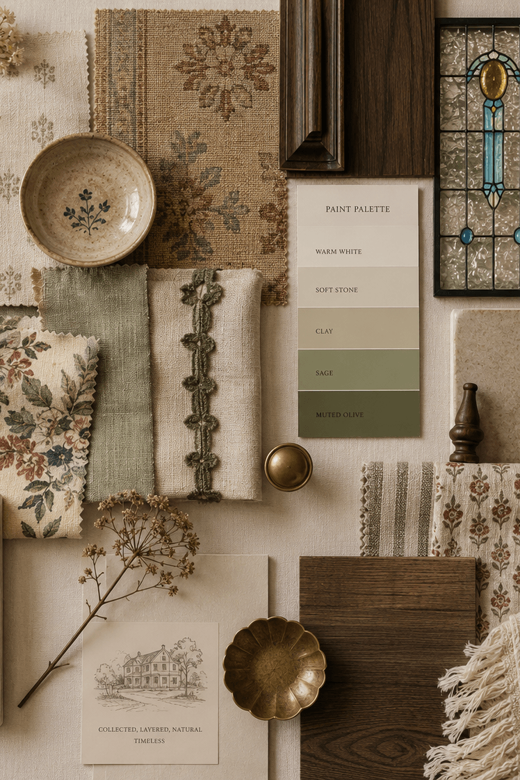
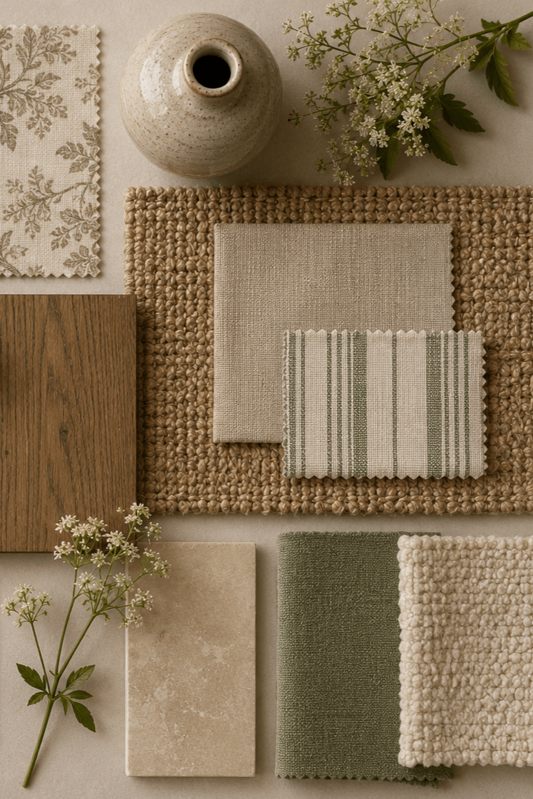
Soft blues, muted greens, warm neutrals and layered natural fabrics were chosen to complement the richness of the existing timber windows. The palette introduces lightness and softness while allowing the home's original character to remain a defining feature.
Why Contrast Creates Interest
One of the reasons dark timber can be so effective is because it provides visual weight.
It gives the eye somewhere to rest.
When every surface is similar in tone, a room can sometimes feel flat despite being technically bright. There is little hierarchy, little contrast and little sense of rhythm.
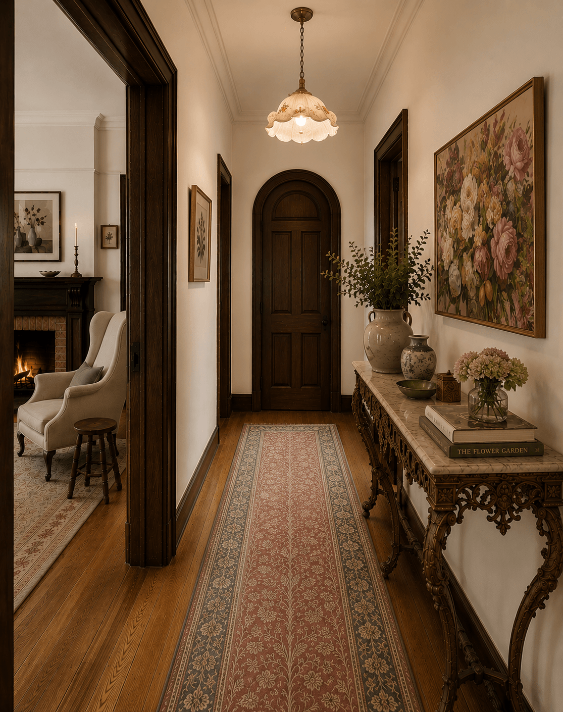
The retained timber introduced depth and structure. Window frames became features rather than disappearing into the walls. Doorways felt framed. Architectural details became more noticeable.
Instead of competing with the lighter elements, the timber enhanced them.
The soft furnishings felt softer.
The lighter walls felt lighter.
The natural light felt more apparent.
Contrast has a way of making both elements stronger.
Old And New Don't Need To Match
One of the most interesting aspects of this project was that a new extension was also being planned.
The original home would retain its character, including the dark timber windows and architectural details that had been part of the house for decades.
The new addition, however, would embrace a lighter approach with white window frames and a more open connection to the garden.
At first glance, this might seem like a contradiction.
Shouldn't everything match?
Not necessarily.
The new extension embraces a lighter palette, modern elements and stronger connection to the garden. Shared materials, natural textures and a consistent sense of warmth help the old and new spaces feel cohesive without being identical.
I often think the most successful renovations allow old and new to speak slightly different languages.
The goal isn't to make the original home pretend it's new.
Nor is it to force the extension to imitate the past.
Instead, the connection comes through atmosphere.
Shared colours.
Related materials.
A consistent feeling.
When these threads run throughout a home, the spaces can feel cohesive without being identical.
The old part of the house is allowed to retain its character. The new part is allowed to feel fresh and open.
Together, they tell a richer story.
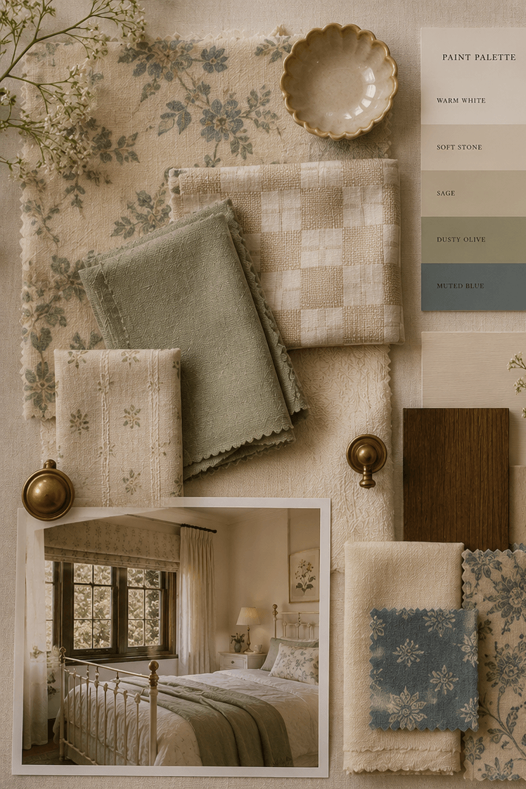
A restrained palette of timber, stone, linen and soft greens helps bridge the transition between the character-filled original home and the lighter, garden-facing extension.
The Beauty Of Keeping What Matters
There is something reassuring about a home that doesn't erase its history.
A home that keeps a few quirks.
A few imperfections.
A few reminders of where it has been.
Not every original feature deserves preservation. Some elements genuinely need updating. Good design often requires thoughtful change.
But sometimes the most meaningful decision is not what we add.
It's what we choose to keep.
The dark timber in this home wasn't standing in the way of lightness. It was helping to create a sense of warmth, depth and character that would have been difficult to replace.
And perhaps that's the real lesson.
Lightness doesn't always come from removing things.
Sometimes it comes from allowing the right things to remain.
Images shown are concept imagery developed as part of a recent Concept & Materials Direction project for a private client. The designs are illustrative and intended to communicate overall atmosphere, colour and material direction.